Reports.
Your pipeline, lead flow, and email performance at a glance.
Reports rolls your sales, contacts, listings, and email activity into one dashboard, with a period selector at the top that reruns every section for the range you pick.
Choosing a period
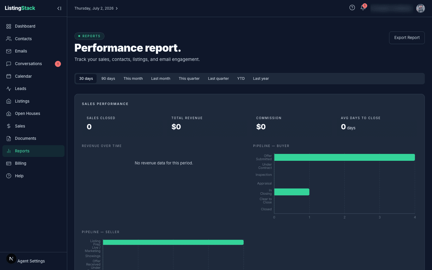
Pick a range from the row of buttons: last 30 or 90 days, this month, last month, this quarter, last quarter, year-to-date, or last year. Everything below the selector reloads for that range, except where a section is explicitly a current snapshot (noted below).
Sales Performance
Counts sales with status closed whose actual close date falls in the selected period: Sales Closed, Total Revenue (sum of sale prices), Commission (sale price × your commission percentage, summed), and Avg Days to Close(days between a sale's creation and its close date).
The Revenue Over Time chart breaks that revenue out by month. The Pipeline charts (Buyer and Seller, shown separately) are the odd ones out — they show your currentsales by stage regardless of the period selector, since a pipeline snapshot from 90 days ago isn't useful today.
Leads & Contacts
New Contacts and New Leads count records created in the period. Conversion Rate is the share of leads created in the period whose status is converted. The Contact Growth chart plots a cumulative count of new contacts across the period; Lead Sources breaks new leads down by their source field.
Listings
Active Listings and Avg Active Price reflect your current listings with status active — not period-filtered. Sold in Period counts listings marked sold and last updated within the selected range. Avg All-Time Priceaverages every listing you've ever entered with a price, regardless of status or period. The Status Distribution chart shows your full listing book across draft, active, pending, sold, and withdrawn.
Email Engagement
These numbers come from your drip campaign logs (see the Email Marketing page of this guide), scoped to emails sent in the selected period: Emails Sent, Open Rate, and Bounce Rate. Subscribers is your current confirmed subscriber count, not period-filtered. The Subscriber Growth chart plots cumulative confirmed opt-ins over time, and Email Performance lists your ten most recently sent drip emails with how many recipients each reached and how many opened it.
Exporting a report
Export Reportopens your browser's print dialog with a layout tuned for it — the period selector and export button are hidden, and each section is kept from splitting awkwardly across pages. Choose "Save as PDF" in the print dialog to get a PDF copy, or print it directly.